



Safety – First Class
BG Prevent
For the transformation of B•A•D into the new BG prevent brand, a comprehensive rebranding sharpened its market positioning and clearly differentiated it from competitors. The central theme of the extensive relaunch: workplace safety at the highest level, delivered by Germany’s leading provider.
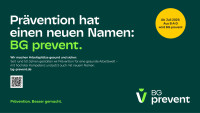


The new corporate brand defines how BG prevent presents itself to the outside world, while the employer brand simultaneously positions the company as an attractive place to work.


Situation: For almost 50 years, B·A·D Gesundheitsvorsorge und Sicherheitstechnik has been the market leader in occupational health, yet it was rarely perceived as a strong brand. The name required explanation, the acronym was potentially misleading, and the brand lacked differentiation, particularly as new competitors entered the growing, unregulated mental health market. What was missing was a clear brand identity that reflected the company’s expertise, ambition, and forward-looking approach.
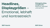
Assignment: Develop a holistic brand strategy, reposition and rename the company, create a future-ready brand design, and implement a new visual identity that can be applied consistently across a complex B2B business.


Result: B·A·D became BG prevent, positioned as a “pioneer for a healthy world of work”, with a clear focus on prevention. The new name combines the brand promise with a reference to the German Social Accident Insurance Institutions, which own the company. The brand design developed by KNSK preserves the brand’s heritage while reinterpreting it in a contemporary and bold way. It features a modernised green colour palette, a distinctive wordmark, an evolved symbol, and a flexible design system for every touchpoint. The new brand identity was launched internally and externally through an integrated campaign, creating a strong and distinctive foundation for future communications.